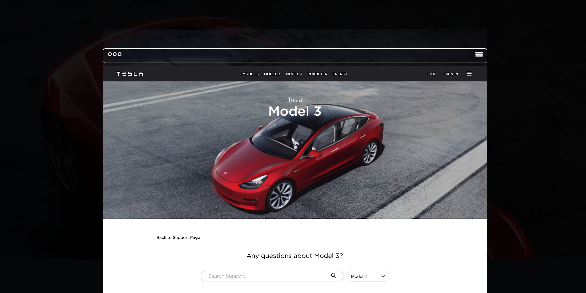
Tesla Support Page Redesign
This project at TESLA was to redesign their Support Pages. I have re-designed its support page to improve our customers' engagement and information accessibility to facilitate a better online self-service experience.
My role: I designed this project from end-to-end, including user research, user interviews, information architecture design, UX design, UI design, prototyping, and user testing. I worked closely with my project manager and other stakeholders to define the business goals and user needs, and discuss with engineers about technical conflicts and limitations to build productive collaboration.
The problem
TESLA’s support page was low on content, and it wasn’t easy to find what you were looking for. In short, the support functionality lacked sophistication. In addition, TESLA went from producing vehicles to expanding into the energy sector. It was hard to get help with a specific product. And with the increase in Model 3 customers, this left the Customer Support team overburdened with calls. The old support model was in dire need of a redesign.
Our Customer Support team urgently needed to create a new website which lessened the number of calls, increased web traffic, and made it easier to navigate a self-service experience.
Our goals
How to redesign our support page to satisfy customers' self-service?
We faced with the task of facilitating a better self-service experience for customers while also bringing down the number of calls to the Customer Support team. We wanted to create an engaging, easy-to-navigate environment that solved these problems.
Solutions
Save time and simplify content
Present content upfront and drive down call rates. Most importantly - we break down the question-support process for our customers. They start out with visual options of a vehicle type, then move on to a specific question related to their target vehicle choice.
User research
Current experience
These survey questions helped me understand the challenges of my redesign process:
Are the titles of the web pages designed in a intuitive and understandable way?
Can the section titles successfully represent the linked content page?
How fast can our customers navigate to their content of interest?
I found out our current support page functionality isn’t very sophisticated and does not communicate to customers efficiently for finding the right information by topics and categories.
Competitive analysis
I evaluated the top brand support pages for inspirations, such as Apple, BMW and other types of companies. I want to see a big picture of other companies how to provide experience for their customers rather only focused on vehicle companies. The analysis focused on five aspects: usability, discoverability, engagement, conversion, and branding.
Here are some examples of my function competitor visual analysis research.
Common highlights
Multiple customer support methods/entries: chat /email /calling /self service /service center /ask the community /customer forum
Quick search recommendations: top ten keywords/highlights/ videos/ FAQ’s
Emotional design: human language /touch /image /content
Interviews
I conducted surveys and interviews of both primary users and the Customer Support team. I had the team walk me through the process of resolving issues along with tracking the most frequent kinds of questions. I also gave users tasks to complete and observed their navigation process. I checked Google Analytics and the clickstream data dashboard to understand user behavior and webpage traffic patterns.
I video-chatted with product managers, customer service staff and customers to understand their expectations and requirements.
Learnings
After interviewing both customers and the Customer Support team, I had a better understanding of their common pain points.
Here are insights and we can improve for the redesign:
Users usually have a product in mind when they come to our support page.
A lot of users prefer google search over Tesla’s landing page because the google search
is much easier and faster for people to find the answers.
The Search Bar could be more functional and customizable.
The FAQs sections lack visual hierarchy and the key information highlight.
The Navigation menu bar placement is not intuitive and visible.
Design goals
Based on my previous research and interviews, here are the goals for my redesign:
Provide a quicker way to select the desired product.
Make it easier to find a category in the FAQs section.
Launch a customer-centered problem-solving experience, such as to seek more information and value to our customers through a community engaging channel.
Create more efficient navigation and integration of self-service.
Design
Wireframe explorations
As we narrowed down the final design, I created an initial set of wireframes. I then presented them to stakeholders and my team for feedback. It is good to have strong communication with users and clients to create a better overall model for them.


